Washington Post - 2016 Election
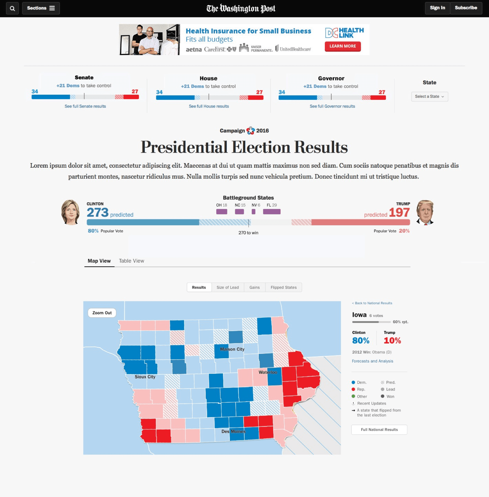
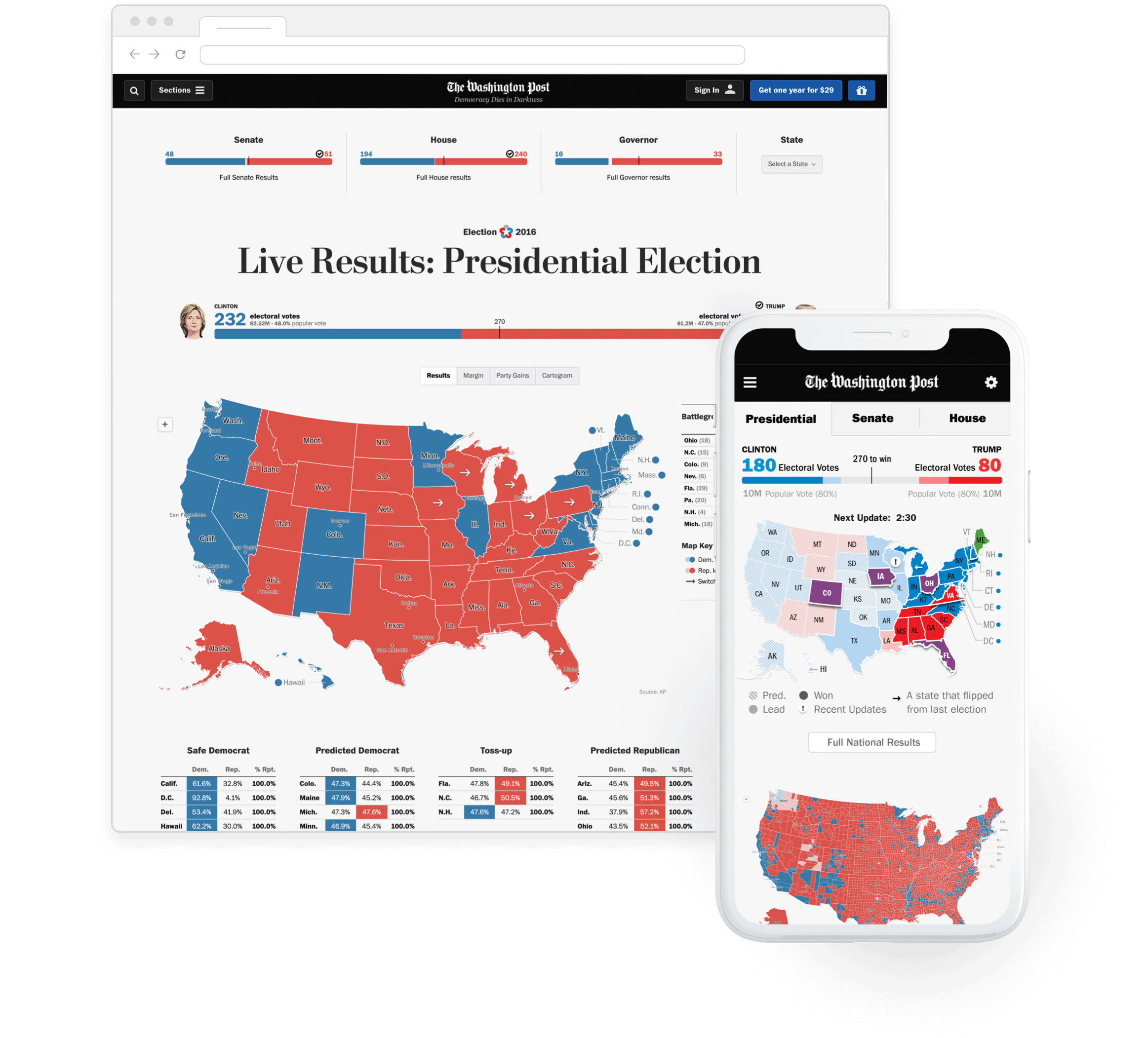
While at Development Seed, we worked with a small team at The Washington Post to create all graphics for the 2016 Presidential, Senate, Congressional and Gubernatorial races. The goal for this project was to add in as much storytelling as possible - to allow viewers to understand what happened / is happening even if they step away.
- Design / UX
- Some HTML / CSS
Allowing for More Storytelling
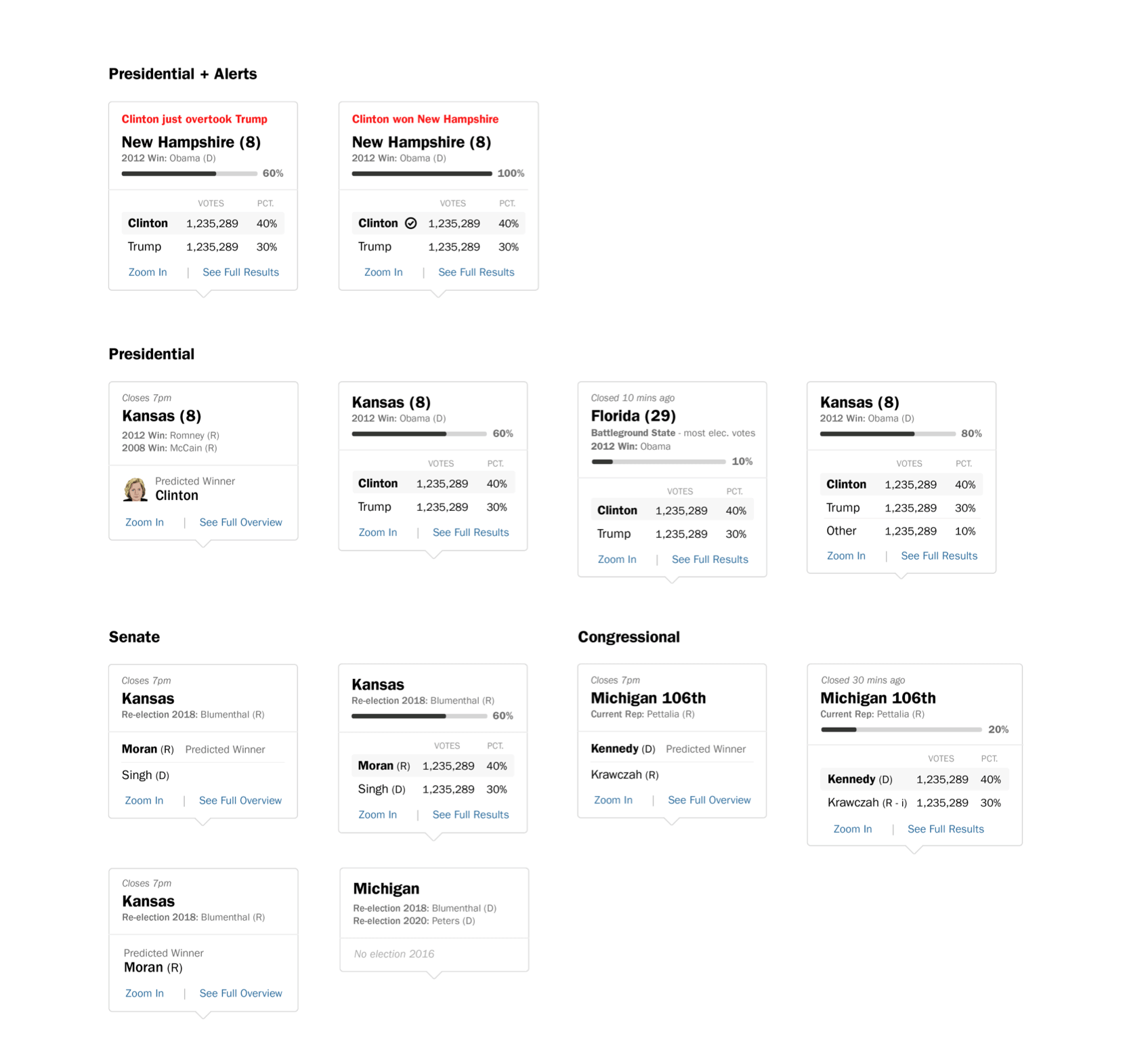
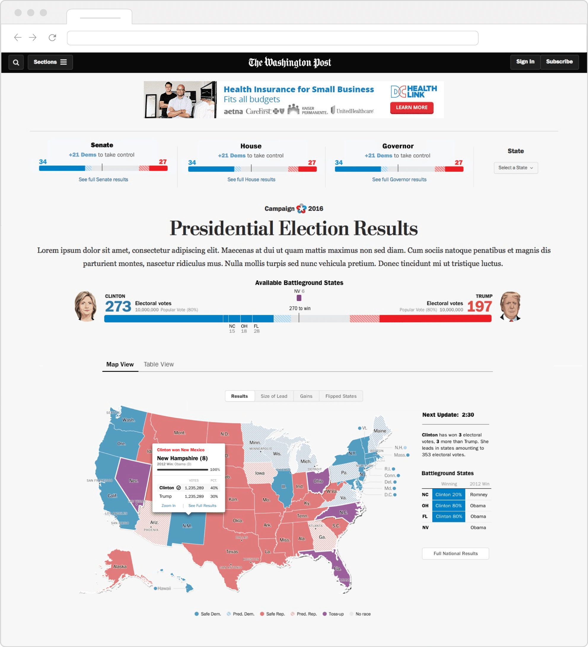
To best communicate the story of the election, I included areas where The Washington Post writers could insert snippets of the latest news. I also added cards that popped up with alerts. These alerts / cards provided the viewer with something more obvious on the map to best understand what was happening.
Process
Kickoff / Discovery
I lead the kickoff meeting with The Washington Post team, where we hashed out goals and what they were hoping to achieve with this project.
MyselfWireframes / Coordination with Devs
I built a set of wireframes as a way to communicate and agree upon functionality with internal and external teams.
MyselfDesign
Working closely with The Washington Post team, I designed the features, in mobile, desktop and tablet that we agreed upon in our planning sessions. The design focused on making the content as readable and organized as possible, while telling a story.
MyselfBuild
Once the developers met certain check-in points or finished pieces of functionality, I would tweak the HTML/CSS to make sure it was exactly what we wanted it to be.
Myself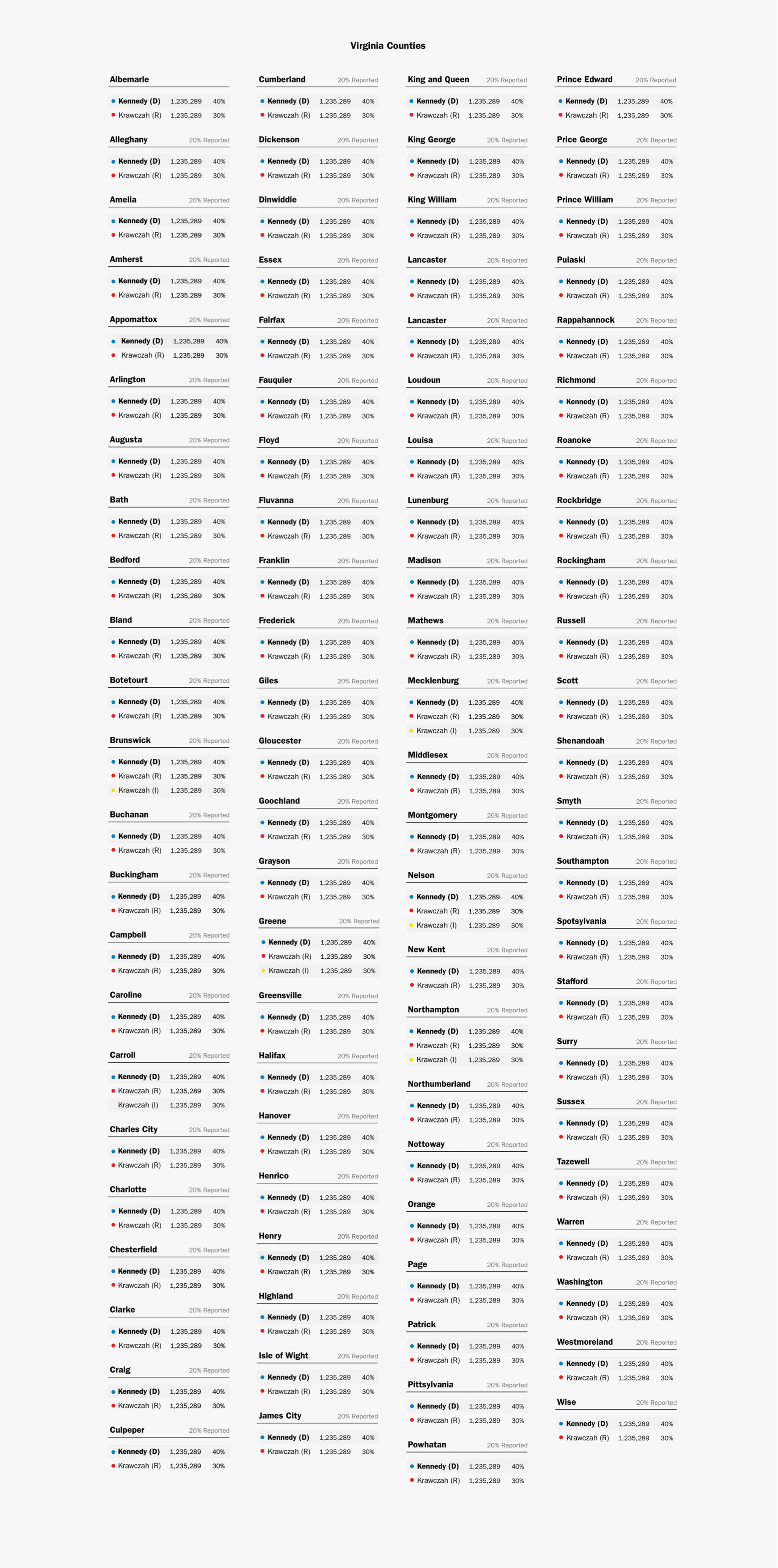
Exercise in Organizing Data in a Small Space
The challenge of this project was fitting the very large amount of data into a small space, while also telling a story. Below are some examples of how I reigned in the data and also pages that provided viewers a way to dive deeper into what was happening.
